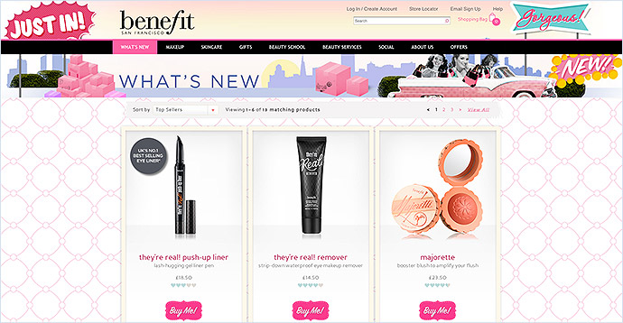
We all know that setting up a successful ecommerce website is not something that will happen overnight, but what happens if you are still struggling after a few months and just don’t know where to start making improvements? We have put together ten things you can look at on your website to help boost sales and make your online shop a success.
Create trust
When doing anything on your site you always need to keep in mind that you are one in over half a billion websites on the internet and for those coming across your site for the first time, you could be anybody. You need to put their minds at rest and convince them you are a genuine business, otherwise they will look elsewhere.
The easiest way to start earning visitors' trust is by adding your contact details. Display your customer service number in the header and make sure it is a landline number; a mobile number will automatically set off alarm bells. Create a 'Contact Us' page and link to it from the header so people can find it easily.

By law you must include the following details on your website and the 'Contact Us' page is the ideal place for it.
- Your business name
- Physical address, telephone number and email address
- Company registration number and place of registration (if you are a Limited company)
- Registered office address (if you are a Limited company)
- Your VAT registration number (if you are VAT registered)
Sell your products
Just adding a selection of products to a website with a price and an add to basket button isn't going to encourage visitors to your site to buy. You need to sell your products to them, give them a reason why they can't say no (and that doesn't mean just slashing the price!).

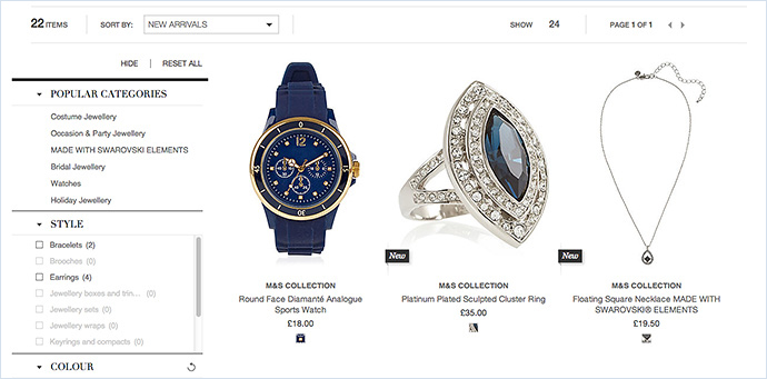
Make sure all product images, whether they are on a category page or product page, are clean, simple and well-sized. There's nothing worse than navigating to a product or category and being presented with tiny images where you can barely see any detail.

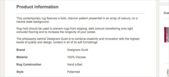
Add concise and informative product information so the customer knows exactly what to expect. Don't give them any reason to hesitate on their purchase or complain once they have received it.
TIP: For more information about improving your products have a read of our posts 10 Tips to Improve Your Ecommerce Product Pages and Best Practices for eCommerce Website Photos and Product Images
Don’t dilute your products
Having a category with a couple of products in it will instantly make a potential customer think that you don't have many products to offer. It is better to create a small amount of categories and have a good number of products in each one than having lots of categories and only having a few products in each.
TIP: Stick to the rule of no more than ten top level categories and no less than ten products per category.
Make it easier to find your products
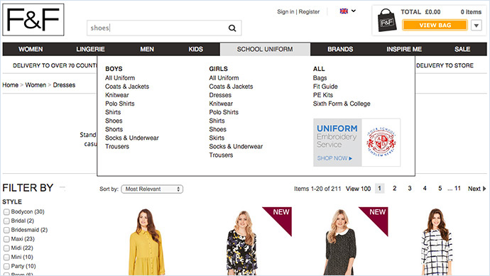
No one has the time to spend ages hunting for a specific product on a website. Make it as easy as possible for customers to find what they are looking for. Utilise all of the search functionality on offer. These include the mega menu top navigation, the search box which sits in the header and the refine results feature which allows the customer to filter to what they want in a list of products.

TIP: For more information about making the most of the search functionality in Bluepark have a read of our post Optimising Your eCommerce Website Search and Navigation.
Inform your customers
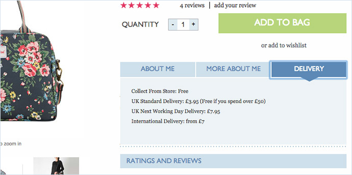
Never leave your customers in doubt of anything they might need to know. Give them the information they need, when they need it. The best example of this is either adding the delivery and returns information to each product page using product tabs or adding a link to a delivery and returns page in the footer. Customers always want to know how much the delivery is going to cost them before going through to checkout.

Don’t put up barriers
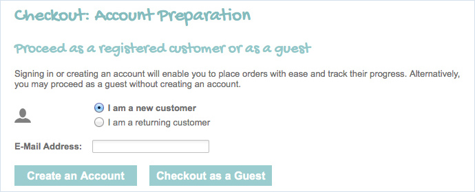
Don't ever stop your customers from doing what is natural when buying online as this will always put them off. Many people prefer to checkout without creating an account either because it is faster or because they don't want you to store their details. The best way to make sure you don't put off these customers is by giving them the choice of checking out as a guest. Always give people the option though as not everyone is the same.

Be found in Google
It is naive to think that you can just add your products to a website and suddenly appear in the number 1 position in Google. You are competing with thousands of others within your industry and many of them will be spending thousands of pounds each week on SEO to make sure they are as high up as they can be.

However, there are things you can do on your site to make sure it is optimised as much as possible for Google to index. Just remember that your website is ultimately for your customers as they are the ones that will actually spend money with you, so all text must be understandable for them.
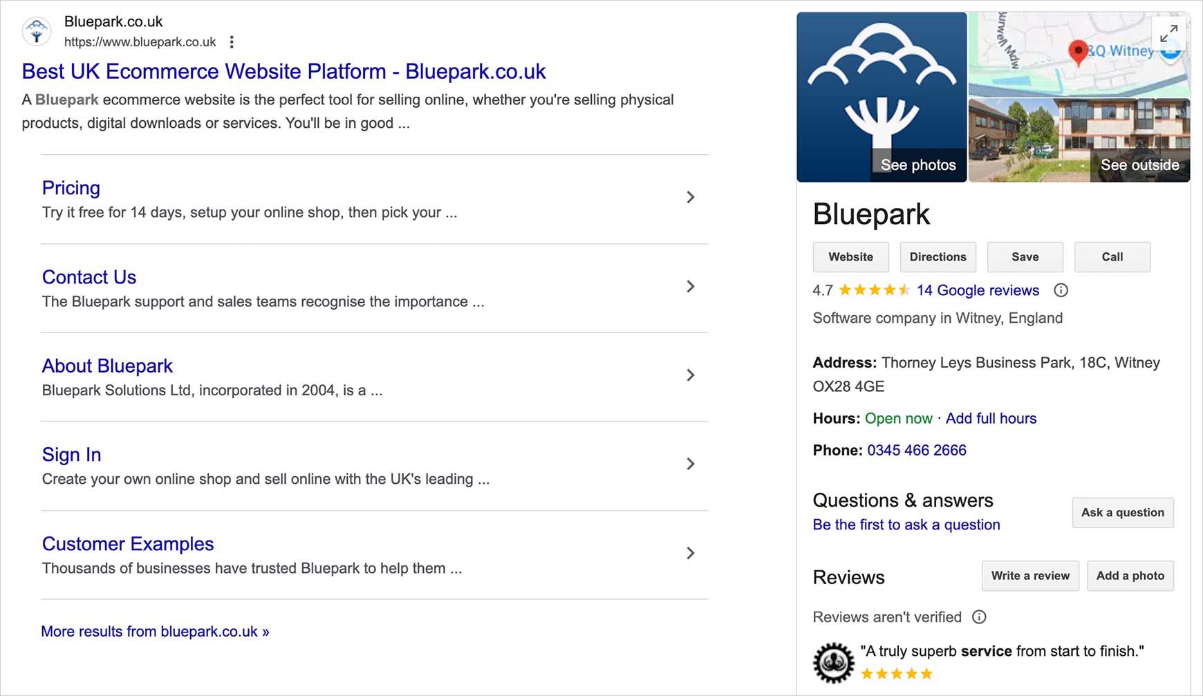
TIP: Make sure Google knows about you by linking your online shop to Google Search Console. Also, have a good read of the Search Engine Optimisation Starter Guide as written by Google and implement as much of it as you can.
Become an authority
It is important to find your niche and build your brand around it. Don’t try and sell everything, focus your product ranges so that people know to come to you if they are looking for that particular niche. Creating an authority on a certain type of product, again, can help to build trust. People will believe that you know a fair bit about that niche and so will trust you to be offering the best products for it.
Well executed niche sites can often fair much better within their market than huge multi-product sites, such as Amazon and John Lewis, due to their targeted marketing. Making the site stand out as the absolute go-to place for your particular product type can create a very loyal group of customers that are willing to pay a bit more for the kinds of products and services that they are passionate about, especially if they are not so easy to find elsewhere.

Don’t let your site stagnate
Google doesn't like websites that always stay the same and never have anything new on them and you will slowly see your site moving down in its listings if you don't update it every so often. Also, your customers will get bored if every time they return to your site it is exactly the same.
You have to keep people interested, so make sure you update your banner images, add new products (and push them in front of the customer) and add new written content, including blog posts. Don’t be tempted to keep changing the design, however, as customers need to recognise your site. If it looks different every time they visit they may think they're in the wrong place.

TIP: If you're unsure of what to write about on your blog, have a read of our post 25 ideas for content rich blog posts.
Design for your customer
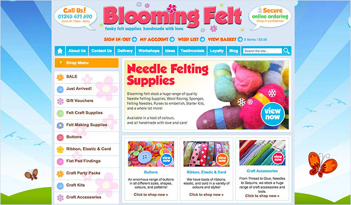
You may have come up with what you think is a beautiful design for your website but is it going to make your customers want to purchase from you? Keep the design clean, uncluttered, readable and unobtrusive as possible. People want to be able to see your products and know how they will benefit them, not be distracted by a multitude of colours and walls of text about your terms and conditions. Remember point 6, don't put barriers in their way, so think carefully before you add anything. Will it put people off?
TIP: If you're unsure of what your customers will expect from your site have a look at your competitor's websites and take notice of common features. Once your site is set up ask your friends and family to spend some time on it placing dummy orders and get them to give you feedback.

