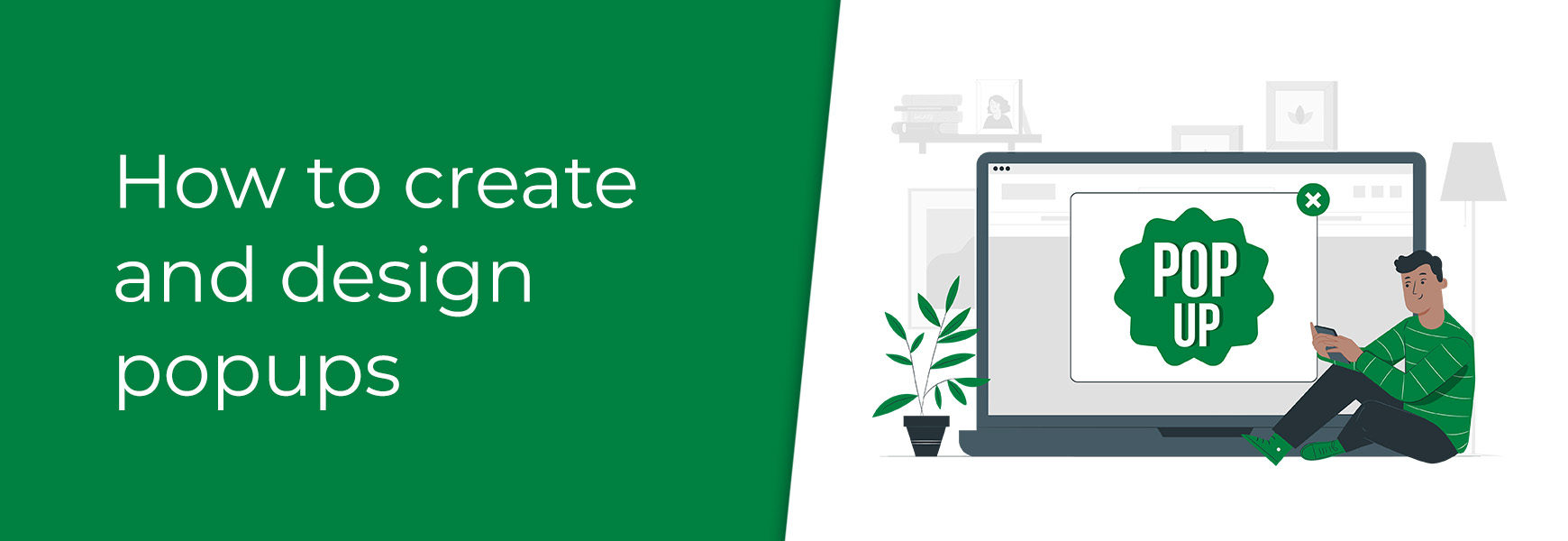
Popups are a double-edged sword, balancing between enhancing visitor engagement and potentially driving visitors away. On one hand, popups can be effective tools in promoting special offers, informing visitors with important news, and driving visitors towards specific actions, such a signing up for a newsletter. They can also help to increase conversion rates by being presented at certain stages of the ordering process. For instance, a well-timed discount offer popup can encourage hesitant shoppers to purchase. However, the effectiveness of popups depends on when, where and how they're displayed. Poorly designed or overly intrusive popups can disrupt the visitor's experience, leading to frustration and increased bounce rates. Frequent or irrelevant popups can make the site look spammy, which diminishes the brand's credibility and will often cause visitors to leave before purchasing. Therefore, they need to be carefully designed and strategically deployed for the best effectiveness. We will go through how to create popups in Bluepark. Not just for displaying standard popups, but also how to create clickable popups, for information such as sizing information for products. The most commonly used popups for online shops are newsletter sign-ups, special offers, discounts, size charts, and shipping and returns info. Create your popupPopups are created using Content Blocks. If you are unsure of what content blocks are, please have a read of our Content Blocks information and How to change the content on your theme guide to find out more. Custom Content BlockSimple popups are created using a Custom Content Block, which allows you to add any content you wish into a single space. To create a simple popup, follow the four steps below.
The popup will then trigger on the page you've assigned it on. How it displays will depend on the settings within the Popup tab, which are explained in further detail below. Responsive Columns Block (V2 only)Our Responsive Columns block has now had the popup functionality added to it. This opens up more flexible design choices and better control on your popup design. We highly recommend reading of our Get acquainted with the new V2 Columns block guide, if you haven't used the Responsive Columns block before. The steps to create a popup using this block are the same as above, you would simply set the Block type to Responsive Columns instead. Popup content block settings and designWithin the Popup tab, there are a few setting sections that can change how the popup behaves.
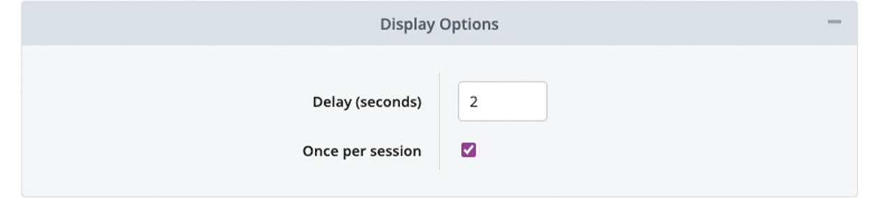
Within Display Options, the Delay (seconds) adjusts the amount of time before the popup displays to the visitor and Once per session toggles how often a visitors sees the popup, either once only or every time they view that page.
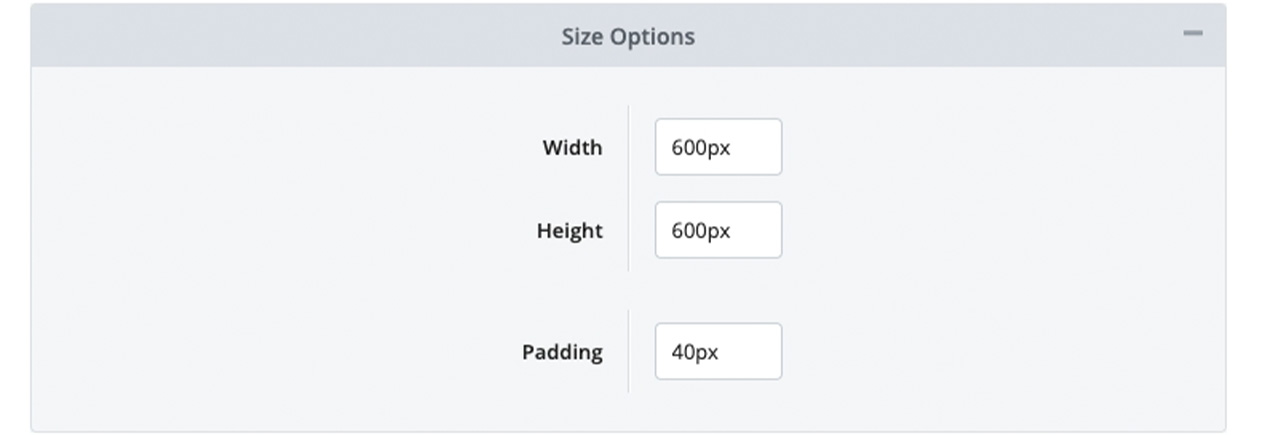
Within Size Options, the dimensions of the popup window can be adjusted using the Width and Height options. The Padding option adjusts the space between the content within the popup and the edge of the popup window.
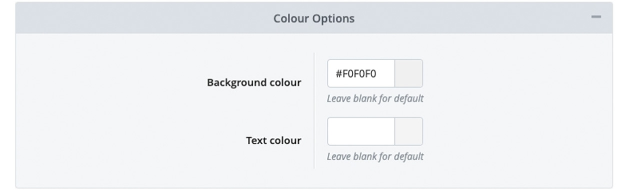
Within Colour Options, the Background colour and Text colour of the popup can be changed from the theme's default settings.
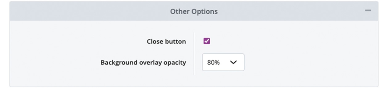
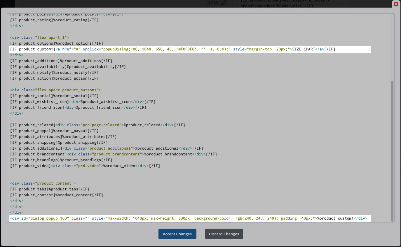
Within Other Options, you can choose if the popup should have a Close button or not. This is to allow visitors to close the popup. Therefore, turning this off will limit your customers from viewing your site, so should only be used in certain circumstances. The Background overlay opacity changes the transparency of the black (or white, depending on the theme) background which overlays the website, behind the popup. For more advanced users, CSS can be used to target these popups for further styling. You can find the ID for the popup within the Inspect tool on your browser or you can add your own Class within the Tags tab. Some effective popup examplesHere are some examples of popups you could create on Bluepark by utilising the popup feature. 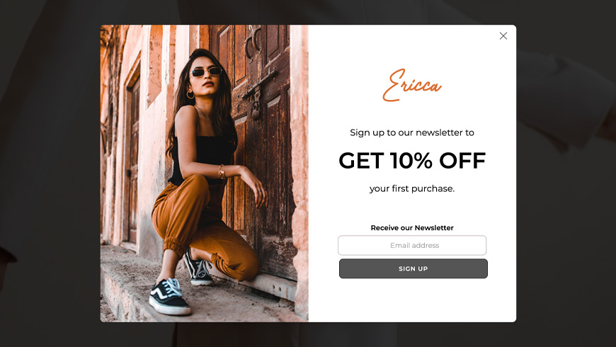 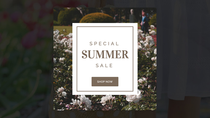 Advanced users onlyClickable popupsA popup can also be created to display once a button, link or image is clicked on. To do this, create your popup as normal, just set the Delay (seconds) field to '99999999'. Strictly speaking, the popup is still set to appear after this amount of time but this adds up to well over a day and visitors would, obviously, have clicked away within this time. Next, assign the block to the relevant Layout. Then, go to the page it appears on, right click and select View Page Source to see the page's HTML. Now, look for the line that's similar to this: window.addEventListener("load", function() { setTimeout(function() { popupDialog(247, 600, 600, 40, '#F0F0F0', '', 1, 0.8); }, 99999999000); jQuery.post('/includes/session.php', { popup: 247 }); });Copy the following section of the code: popupDialog(247, 600, 600, 40, '#F0F0F0', '', 1, 0.8);Lastly, paste this code into an 'onclick' function that can be used on a button, link or image. The example below is using it on a button element: <button class="button b_basket"onclick="popupDialog(247, 600, 600, 40, '#F0F0F0', '', 1, 0.8);" type="button">Pop Up Test</button> Add the completed code to the page, or Custom HTML field, where you want the element to appear. If using the button code above, the styling will be the same as the add to basket buttons in the theme. If you prefer the styling of the standard buttons on the theme, change the b_basket class to b_standard instead. Alternatively, add your own class and style it within Additional CSS. Pro users onlyUnique product content clickable popupsAn advanced version of clickable popups allows you to display different content in a single popup on a by-product basis. An example of this would be a Size Chart for clothing where the sizing information is different for each product. Utilising Custom Data Fields in the Product Editor is perfect for this and the steps below show how this is done. 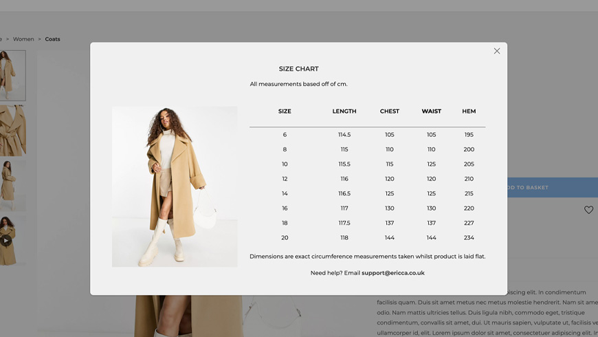
Each element of the popupDialog code corresponds to the popup's settings chosen within the block. So, if any settings are changed on the block settings, such as width, height, and padding, then it needs to be changed on the popupDialog code too. The code can be broken down as follows: popupDialog(100, 600, 600, 40, '#F0F0F0', '#000000', 1, 0.8);
Recommended reads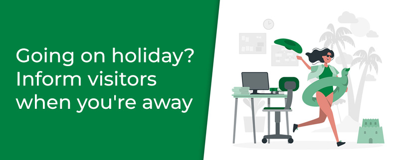 Going on holiday? Inform visitors when you're away Learn how to maintain your online shop when you go on holiday. 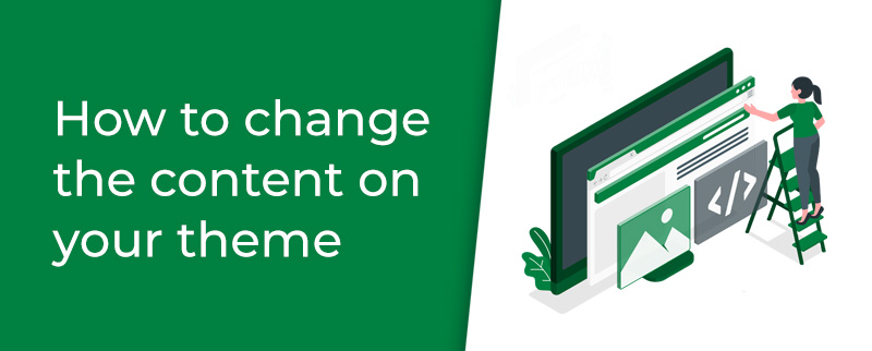 How to change the content on your theme Follow our step-by-step guide to add your own content to your theme. Try Bluepark for FREE for 14 daysFull access to everything including our support team, no card details required |
|

× Create your free trialGet started for FREE for 14 daysWe recommend building your online shop on a desktop device for the best possible experienceAlready have a free trial? Sign In Now |
|