As of March 2024, over 60% of all website traffic comes from mobiles. This is up from 37% in 2015 and just 6% in 2011. Therefore, ensuring your online shop is set up using mobile web design best practices is imperative to converting visitors into customers. In this guide, we’ll fill you in on everything you need to know about mobile website design and how to do it right to sell more. You can see how many page views you get from mobile on your Bluepark online shop by going to Customers > Site Statistics > Top Browsers tab in your admin panel. Any mobile browsers will have (Mobile) after their names. You can then see how many orders you get via mobile by going to Orders > Sales Statistics and using the All Devices drop-down on the top right to toggle between device types. Why is mobile web design important?Apart from the obvious figures above, Google now primarily uses the mobile version of a site's content for indexing and ranking and will rank sites that provide a good mobile experience above those that don't. Therefore, if Google's smartphone crawler struggles to view and read your site as a mobile user would, it will impede your SEO. 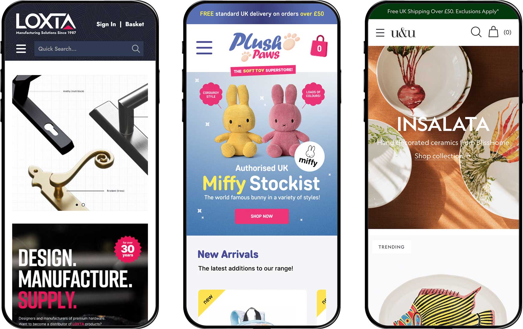 A mobile-friendly website can also lead to higher conversion rates. When visitors can easily navigate and interact with your site on their mobile devices, they are more likely to convert and less likely to leave and go to a competitor. Put simply, if your site is not optimised for mobile, you could be losing out on a lot of sales. How do I start?All Bluepark V2 themes are design to be mobile-friendly, using modern coding standards and keeping heavy loading code to an absolute bare minimum. This ensures they load fast on all devices, which is especially important on mobile if the visitor is using their mobile signal rather than Wi-Fi. Unlike the previous V1 themes, with V2, there's no separate 'Mobile' setting for the theme, which allows visitors to enjoy the same experience on mobile as on desktop. Some sections function differently, to ensure they can be used on mobile, such as the top navigation being accessible via the Hamburger menu on mobile, as opposed to across the top of the site as on desktop. However, the content is always the same. If you haven't upgraded from a V1 theme, now is a good time to do so. With V2, it is advisable to keep changes to a minimum, such as simply adding your logo and changing the colours to match your brand, unless you understand both desktop and mobile web design and how they work with user experience and SEO. This will ensure you're not undoing any of the best practice standards already in place. Find out more about switching to one of our V2 themes. What are mobile design best practices?We now understand why mobile web design is important, but what actually makes it mobile-friendly? We've added some best practice tips below. Remove the clutterHave a good look at all pages of your website via a mobile phone. Does is look cluttered? Are there sections on there that just don't provide the visitor with anything useful? Is there anything that will stop visitors from adding products to their basket and checking out? Is there outdated content anywhere? If the answer to any of these is Yes, then it's time to start decluttering. 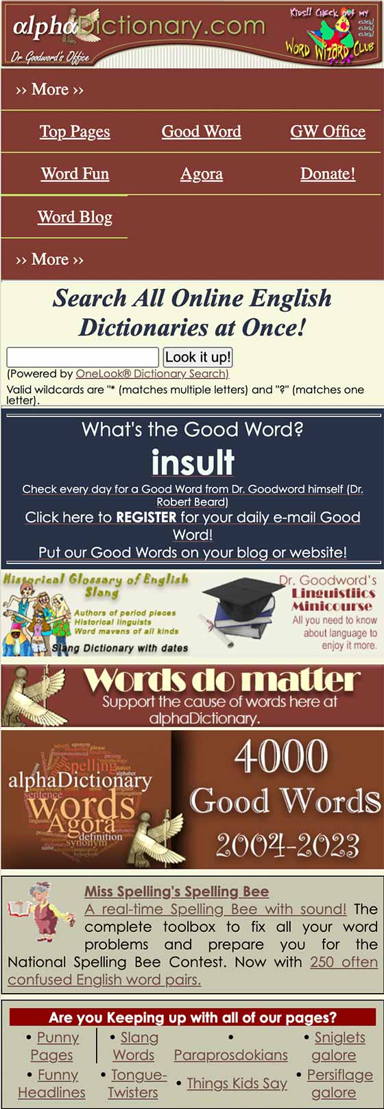  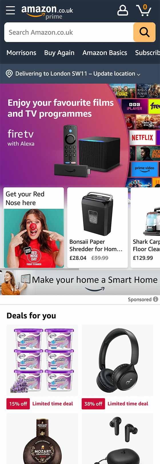 The above examples of cluttered mobile sites shows exactly how overpowering a website can look when viewed on a mobile, especially the first two. When looking at them on a small screen, clutter is amplified and makes it hard to separate content quickly. In both web design and marketing, this is known as 'throwing the kitchen sink at them' or rather, showing them everything upfront, just in case. A better way to design your site, especially the homepage, is to prioritise content, only adding things that are necessary or can encourage the visitor to explore other areas of the site further. This creates engagement, meaning the visitor starts to become invested in the content, and understanding the brand, as they spend more time on the site and are therefore more likely to convert into a customer. Breathing spaceAny good web design will have what's know as whitespace. This is the spacing between text, graphics, images, and blocks on the screen, which won't necessarily be white, but is simply the areas where there isn't any content. Whitespace is important, especially on mobile, because it gives different sections of content breathing space and allows visitors to focus on each one, rather than struggling to separate them. It makes websites easier to read and navigate and allows important things like call-to-action buttons, prices, and titles stand out from the rest of the content. It also makes it easier to click on things on a touch screen, whether that be mobile, tablet or a touch screen laptop. When objects are close together, it's too easy to click on something you didn't mean to, especially if you have larger fingers and thumbs.   The two examples above show a website without any whitespace (on the left) and one with whitespace (on the right). On the one without, it's hard to see titles of sections, so it all looks like one block of content. You can also see how easy it would be to press on the product image below the add to basket button of the product above, leading to frustrated visitors. The one with plenty of whitespace gives each section of content its own breathing space, allowing you to easily read and understand each one. The titles are clear, there's spacing between products and clickable objects. It also looks more professional and well thought out. Readable textWe all know how infuriating it can be to try and read small text on a mobile and those with eyesight issues will struggle even more. Therefore, making sure text is large enough to read on mobiles is important for accessibility. This can be achieved either by having larger text throughout your theme, so it is the same size on desktop and mobile or by adjusting the size of the fonts via media queries, if you're proficient in CSS. Our V2 themes are already setup with recommended size fonts, so if you're unsure, it's best to leave these as they are. Another thing to consider is the colour of text and the background it's displayed on. For instance, some font colours almost disappear or are hard to read on certain backgrounds, such as white text on a bright yellow background. And others can create a strange blurred effect around the edges of the text, such as red on blue.   Lastly, refer to the rule above and make sure any text you add has enough breathing space. Cramming big blocks of text together on one page without space, titles, sub-titles and imagery to break them up, makes them hard to read and visitors are likely to just not bother. This is particularly important when putting blog posts together or important information pages, such as delivery and returns. When displaying anything important on a website, such as product title, price and call to actions, including the add to basket button, it's important to consider size, colour, and spacing and how legible it makes the text. But, don't forget about all other areas of text, such as your logo, descriptions, delivery information and so on. If you're in any doubt, ask a variety of people to test the site for you and give feedback on readability. Large call-to-actionsCall-to-actions, such as links and buttons, are vital elements in mobile web design due to the limited space on the screen and the often distracted nature of mobile users. Therefore, it's crucial that call-to-actions are large enough to stand out enough, to be spotted at a quick glance, to effectively guide users towards desired actions. This is particularly important for the add to basket and checkout buttons because these will ultimately lead to sales. 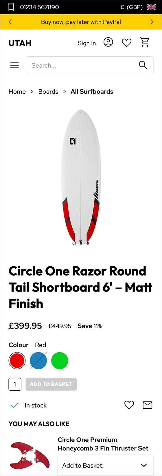 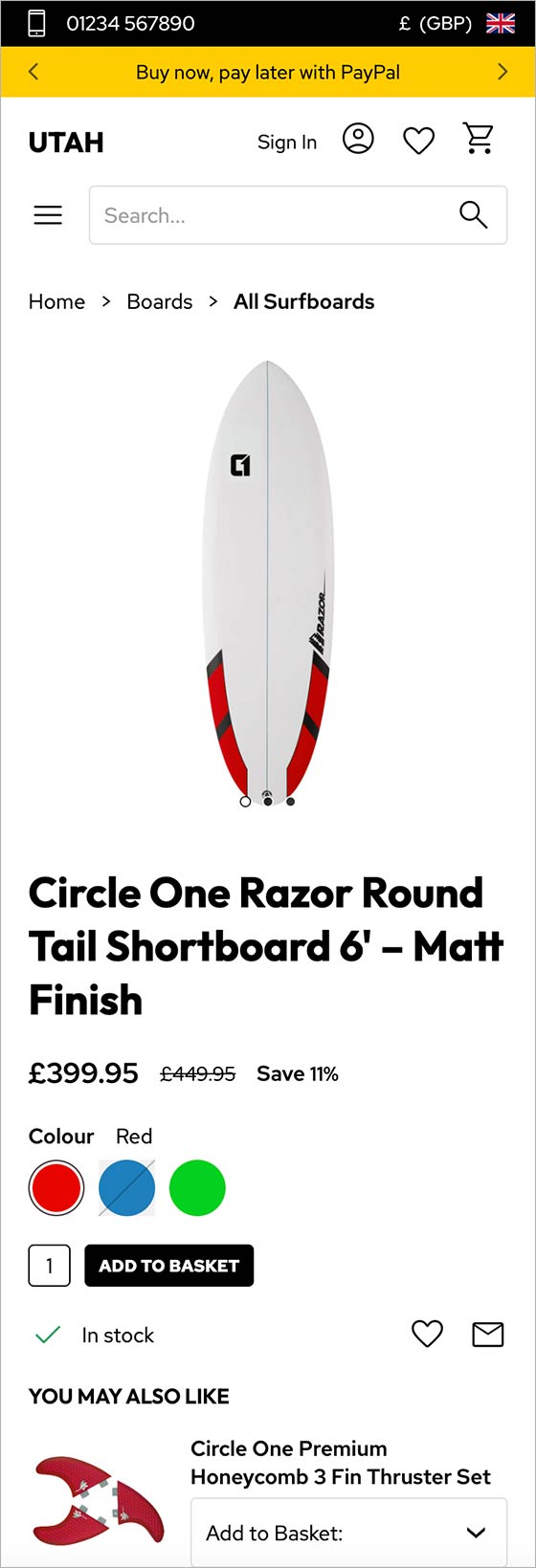 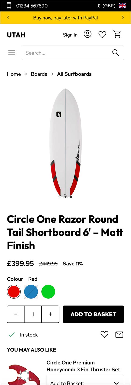 As you can see in the first example above, if the colour of the background and text is too similar to the background of the site, it simply doesn't stand out from the rest of the content. If your buttons are too small, as in the first and second examples, visitors will struggle to click on them with their fingers or thumbs, leading to frustration and will often leave the site. The third example shows a larger call-to-action, both with the quantity field and the button, making it one of the first things you spot on the page. Streamline navigationMega menus are great on websites viewed on desktop, however, unless they're carefully thought out, they can lead to issues when they're displayed on mobile. This is due to the limited space on the screen and the attention span of the visitor. The first thing to consider is the number of top navigation links, the ones you see initially on desktop before you hover over them. Best practice is to keep this to 10 or less, with 7 being the optimal number. Once they're displayed within the mobile navigation, the links that displayed horizontally on desktop are now shown in a vertical list. If there's lots of them, you would have to scroll through them to see the last ones and many visitors may not realise this and simply won't navigate to those last few categories or pages.
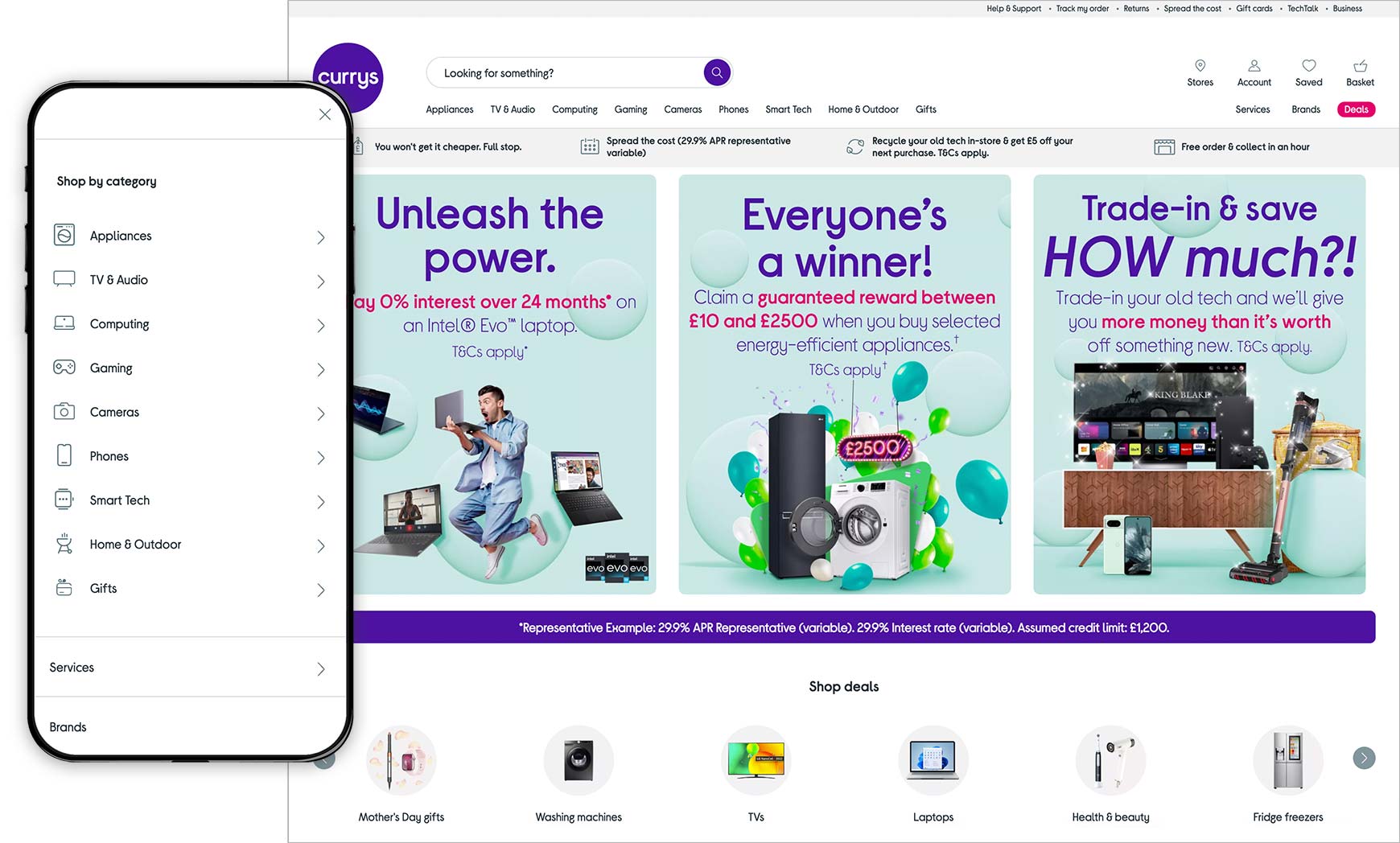
The example above shows how you can organise a huge number of different products into just 9 top navigation links and how they appear on desktop and mobile. Have a good look at how many your online shop has and, if you have over 10, see if you can reduce the number down by combining some into a drop-down underneath one top link. Find out more about setting up a mega menu. Another thing to consider is the number of clicks it takes to get from the menu to a list of products on mobile. With all Bluepark V2 themes, this can never be more than 3 clicks, which is the best practice maximum. So, from the top nav link, you can click to a sub-category and from their click into a sub-sub-category and then finally view the list of products. Optimise imagesImagery is so important on websites, especially online shops, because they help to engage people much quicker than text. As the saying goes, a picture paints a thousand words. Therefore, considering how images will display on mobile is essential to providing a good user experience and converting customers. Our Best practices for website photos and product images guide explores everything you need to know about optimising your images for web. However, the things to particularly consider for mobile is file size and shape. If the file size of your image is large, it will take longer to load and, if the visitor is viewing the site via their mobile signal, rather than Wi-Fi, the image will take even longer.
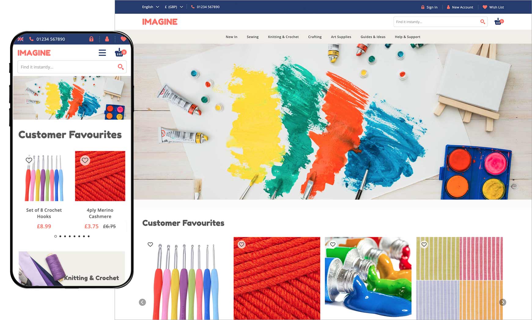
It is also recommended to keep images to square or portrait-style rectangle. This is because landscape-style rectangle images will become extremely small on mobile, as seen with the Slideshow image above. For this reason, we've added in lots of tools into our Content Blocks, such as the Slideshow, where you can change how the images display for smaller screens, or even add a different image specifically for mobile. Have a watch of our How to set up your V2 Slideshow guide to find out how this works. Lastly, avoid embedding text into your images before uploading them to the site. Text within these images will always become much smaller on mobiles and will often be illegible. Instead, you can use our text overlay feature in Content Blocks, such as the Slideshow and the Image Gallery to upload images and overlay text on top. This will allow the font size to remain large for all devices whilst the image shrinks. Limit pop-upsLet's face it, we all hate pop-ups, yet most websites have at least two, the cookie banner and the email sign up pop-up. On mobile these can be even more irritating, especially if you have to click on lots of pop-ups before you can even see the site, as shown below. The Bluepark built-in Cookie Banner is optimised for Google's Consent V2 and will only take up a small portion of the mobile screen, rather then covering the whole thing. 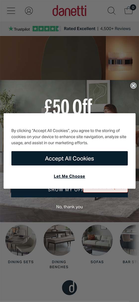 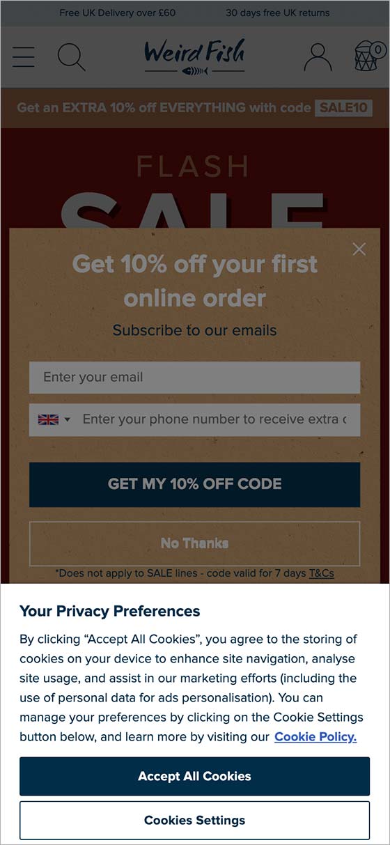 For the email sign up pop-up, it's recommended to set a delay on this, so it doesn't trigger as soon as the site opens. As a rule of thumb, you should delay your pop-ups to a second or two before the average time visitors spend on the page. This data can be found within you Google Analytics (GA4) account by going to Reports > Engagement > Pages and Screens and looking at the Average Engagement Time for that specific page. Any other pop-ups should be added to the site only if they are absolutely necessary. Don't add any to the checkout process, unless it's the checkout success page, and only then trigger it after a few seconds. The one thing you don't want to do is irritate people as they're checking out because they may abandon their order. Responsive contentAlthough all Bluepark V2 themes are fully responsive, sometimes the content you add will force the site to be too wide for smaller screens. The main culprit of this is the use of fixed width tables, as shown in the first image below. Ideally, tables should never be used in mobile content but if you can’t get away with not using them then they must always be set at 100% wide, rather than a fixed width. This will allow the table to sit correctly on the desktop and then shrink down when viewed on a mobile, as shown in the second image below. 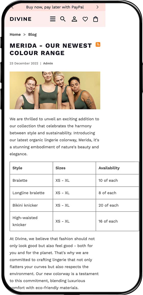 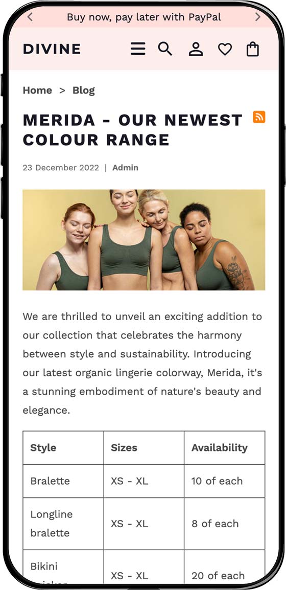 Another element to look out for is YouTube videos that you embed into content areas, such as the product description or within content on your homepage. Despite being owned by Google, YouTube have not made their embedding code responsive! If you find any YouTube videos having this issue on your site when viewed on mobile, get in touch and we'll explain how to get this sorted. Remove heavy loading codeJavaScript and jQuery is used in most websites but it does add extra load time when viewing a page. Bluepark's V2 themes have been designed with the bare minimum of this type of code for this reason. However, always be aware that adding your own additional JavaScript and jQuery will slow your site down - this can include any widgets or functionality that has been sourced externally. Therefore, it is extremely important to consider whether or not the code is absolutely necessary and if there is an alternative way to do it. If you're unsure get in touch with our Support Team. Try Bluepark for FREE for 14 daysFull access to everything including our support team, no card details required |
|
|

